Slow your Scroll and Get the Look
I am not a designer. I want to make that clear. Although, if you add up all the time that I've spent reading design blogs, design books, scrolling Pinterest and working on my own home, I probably could have actually gone to school. I have learned a lot about my own style in the past few years and I've learned how to implement it in my home.
If you're anything like me, when you scroll Instagram or Pinterest, you find yourself staring at beautiful rooms. Kitchens, bathrooms, bedrooms, even kids' playrooms make you stop in your tracks! Sometimes you Pin the image to save it for your "Someday House", sometimes you show your significant other and say "what about this?" and sometimes you sigh and scroll to the next picture. But maybe - just maybe - the images you're seeing don't have to be ideas for your Someday House! Look at the photo that caught your eye and try to determine what it is that you love so much. Is it the lighting or the style of the light fixture? The color combination in the room? Maybe it's the way the furniture is arranged or the style of the coffee table. You may be able to compare images and notice that you keep landing on rooms with caramel leather sofas and dark, striped rugs. A pattern may emerge and you'll start to realize that you really love light walls with warm wood accents and lots of greenery (raises hand). By identifying the elements of the room that you like so much, you can recreate that look and feel in your own home without purchasing the exact sofa and rug combination in the image.
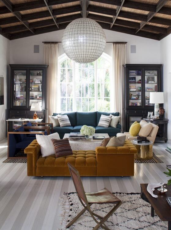
The image above is one that caught my eye, designed by a crowd favorite, Nate Berkus (you've probably seen his collection at Target if you're not familiar with his interior design work). This image was striking to me so I tried to identify what it was that caught my interest. It was the bold color combination of teal blue & sunset orange along with the big, beautiful capiz globe chandelier which popped off the gorgeous wood ceiling. While the big velvet, tufted chaise lounge steals the show in this image, it isn't super practical for me with two young children and a dog at home. My floor plan also wouldn't allow for this furniture arrangement but I could definitely incorporate the teal blue and mustardy orange in art, throw pillows or even a rug. I also love the symmetry that's created by the black bookshelves flanking the window and the chandelier centered over the seating area. The remaining pieces layered in make the room interesting, cozy and unique.
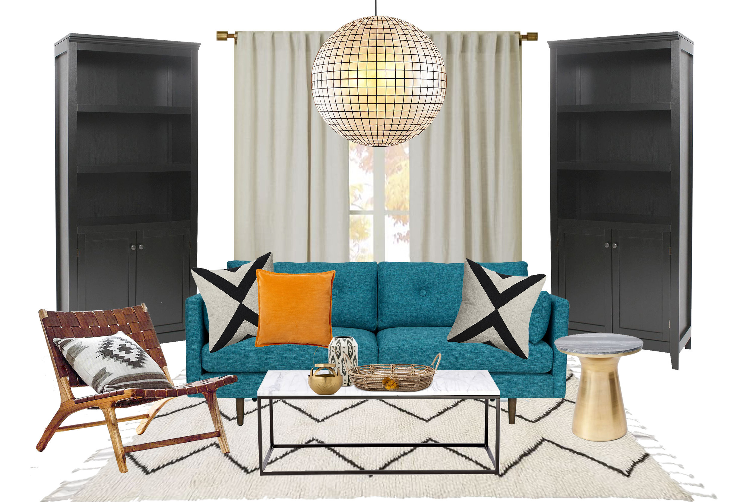
teal sofa | marble coffee table | black bookshelves | capiz chandelier | leather side chair | gold side table | rug | curtains | x pillows | orange velvet pillow | small lantern | black & white vase | basket
As you can see above, we can easily recreate the look and feel without using the exact items from the original photo and without spending a ton of cash. I chose a teal sofa with modern lines and added a couple of bold, black & white pillows as a backdrop to the sunset orange velvet pillow. The black bookshelves create symmetry around the window, add great storage and provide a place to display your beauties. The leather side chair adds some much-needed warmth to the space and its a comfy spot to read a book (or check your phone). In honor of Nate Berkus and his inspiration for this room, the accessories on the coffee table are from his Target collection. Links to all of the products I used are included below the image.
So, next time you fall in love with a room that you see on Instagram, slow your scroll and take a minute to really look at the photo and identify what it is that makes your heart beat a little faster and find a way to incorporate those things into your home.


