Before & After: A Total Transformation in Edina
Oh, Dewey Hill, what a project you were! But in the end, you were such a beauty.
Poor Dewey was a bit of a disaster and seriously needed our help. We saw so much potential with the space, home site and location and knew the second we saw it that it was our next renovation. We started the process of purchasing the home as a short sale in the Spring 2014. After 6 long months of wiffle ball... and about two days of hard ball, we finally closed and were able to start the project.
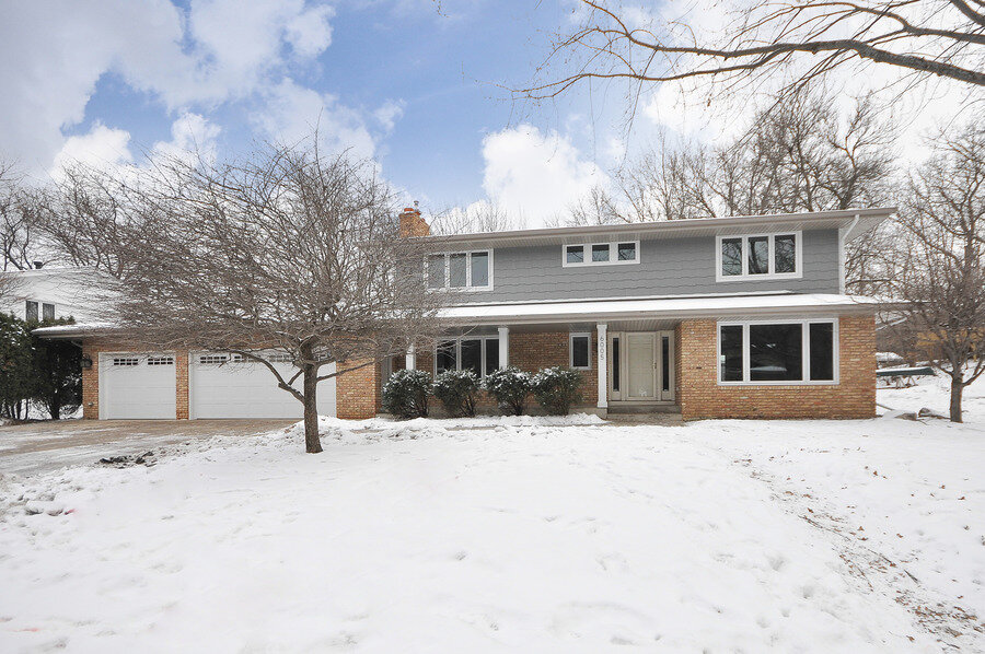
We replaced the siding with LP Smart Side in a gray blue color. We didn't want to change or paint the brick, so needed something to compliment the color. I really like the way this turned out. We took this photo before the front door was painted in a deep brown/almost black color. It looked really sharp!
MAIN LEVEL
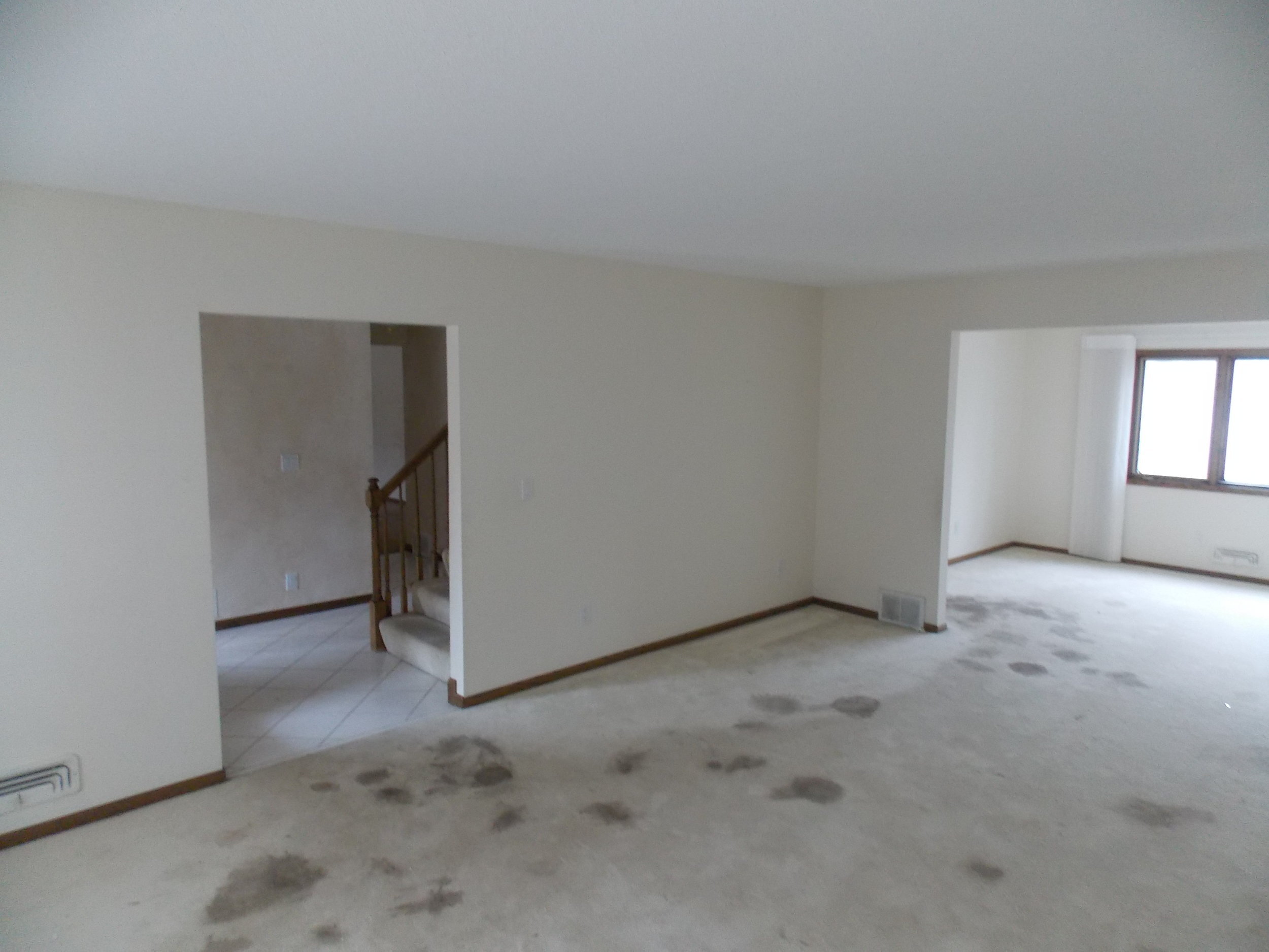
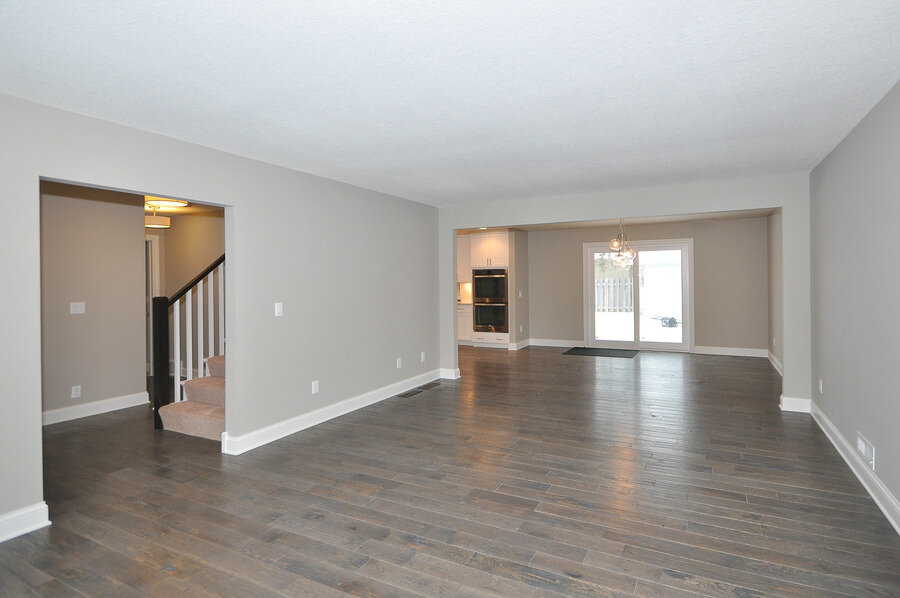
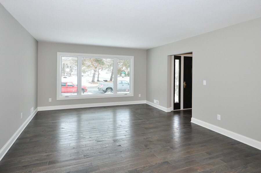
The home was owned by someone who wasn't able to keep up with necessary repairs and upkeep, but it had great bones and great spaces. It just needed our love! We opened up the main level by just removing and minimizing a few walls and changing the layout a bit.
We added a patio door where the window was for more light and access to the backyard. And seriously, what are those stains? They were sure something.
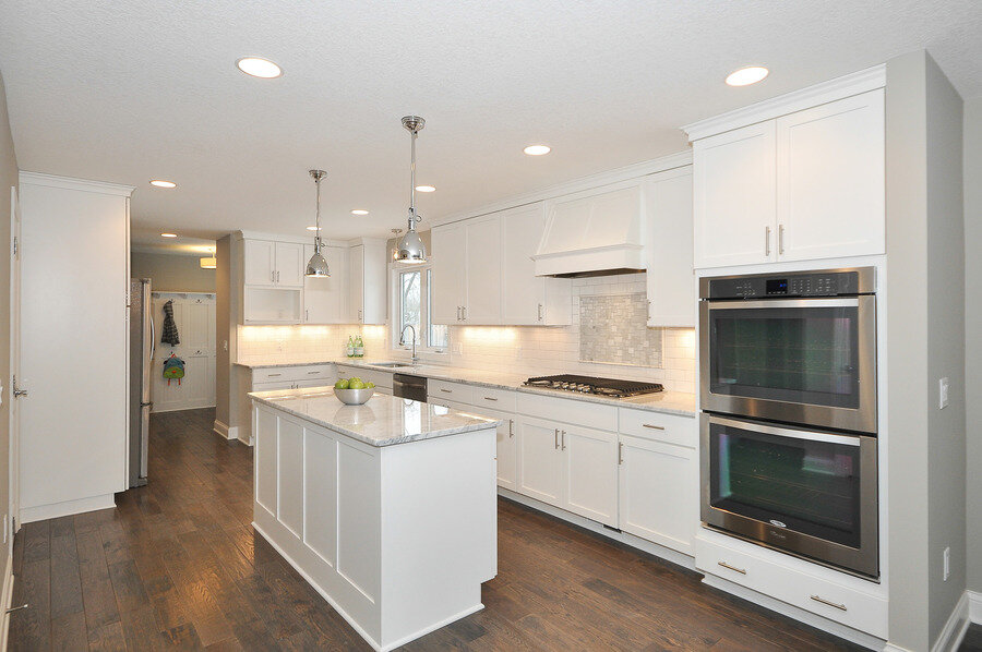
Of all the homes we've renovated, this was by far my favorite kitchen. We did a semi-custom line of cabinets in a white shaker panel, cararra marble countertops, Whirlpool Gold appliances and a subway tile backsplash with marble inlay. The before kitchen was small with an eat in area on top of the dining space separated by a wall. We removed the wall to open the dining into the kitchen and removed the eat in kitchen all together. We added a walk in pantry (took some space from the closet/office behind) and a center island. Dreamy!
We used the eat in kitchen as more space for the appliances and cabinets. We covered up the existing sliding door and moved it into the dining room. It is always a struggle deciding whether to remove a window or door, but sometimes you have to in order to give the best use of space. In this case, it was an easy decision since we were able to keep the window above the sink and move the patio door over just slightly.
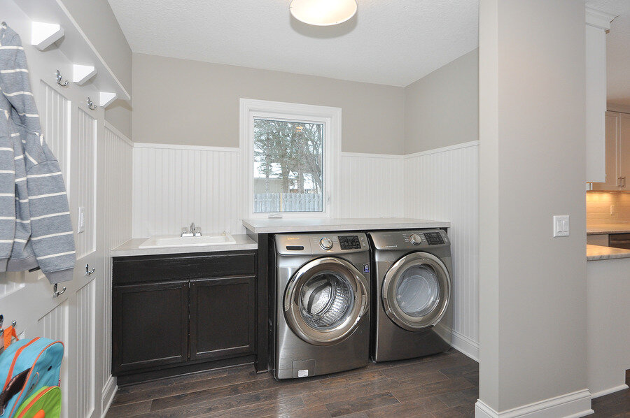
The laundry room was in the mudroom/garage entry and it needed some creative re-working to give it the best use of space. We removed the closet and access door. We already had a patio door in the dining room, so knew this door to the backyard was a bit redundant. We converted it to a window to keep the great natural light and view of the backyard. I love the look of the bead board and moldings in the after. It is a fairly inexpensive way to create a more custom look.
We added a closet to the main level office so someone could use it as a main level bedroom if needed. It was a very big room, so stealing some space for the kitchen pantry and adding a closet was an easy decision.
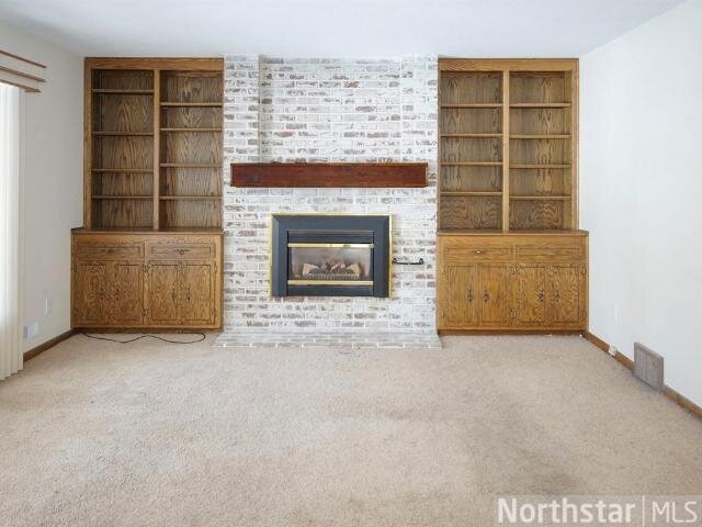
From a cost perspective, it made more sense to remove the built ins rather than spend the money to sand and paint (the natural grain of oak tends to show through paint and is more $$ to paint because of that) and paint the current brick rather than reface the fireplace. Our first instinct was to paint the brick white, but I'm glad we went dark. I really love the way it looks!
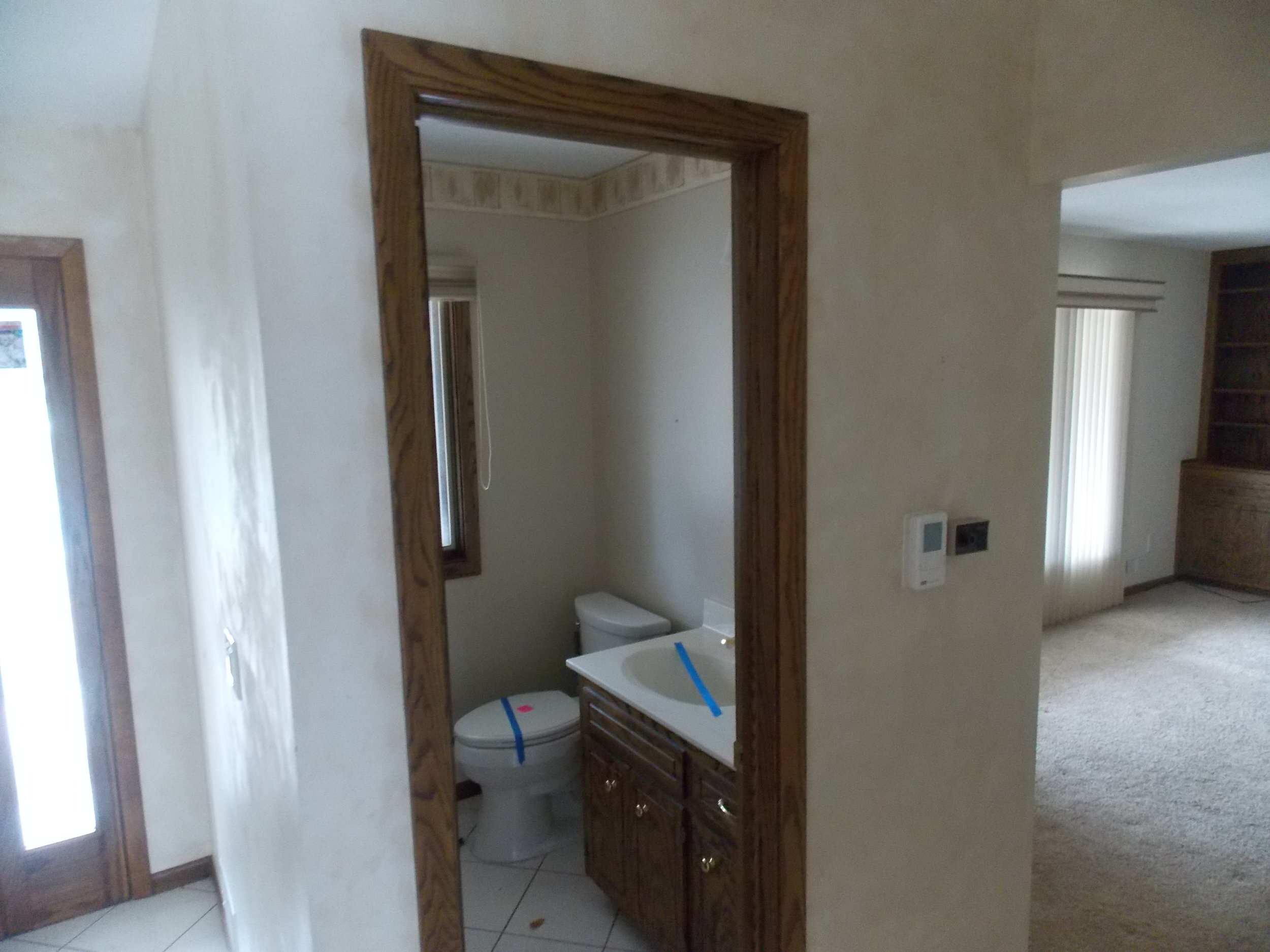
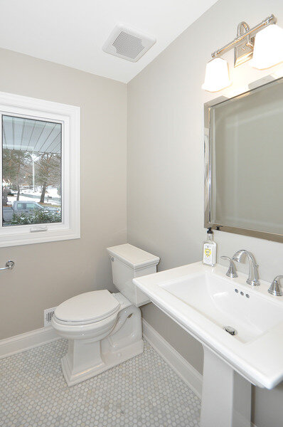
The main level bathroom already had the right layout and was just in need of a serious make over. We decided the vanity was overkill and went for the large squared pedestal sink- always a favorite of mine!
We had a lot of fun coming up with the vision for this home. We knew the main level had so much potential for the perfect open concept with the removal of a few walls.
UPPER LEVEL
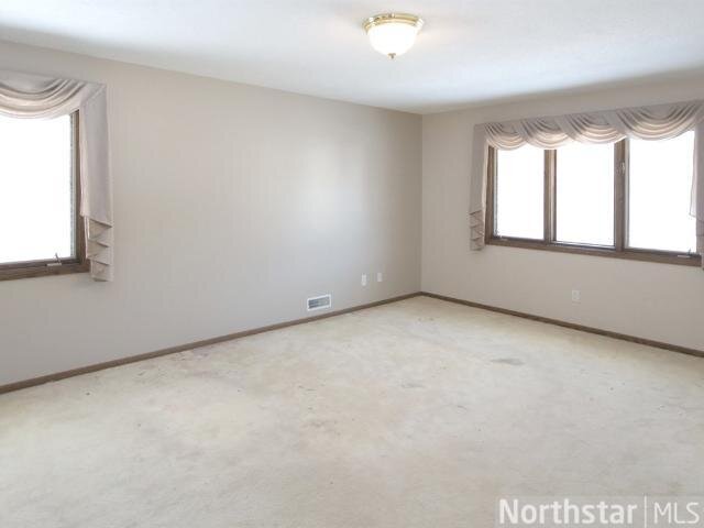
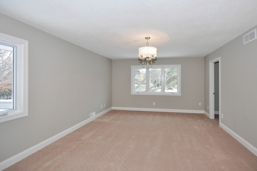
For the upper level, it was previously 4 bedrooms with a hall bathroom and a very small master bath and closet. We decided it was best to get rid of a bedroom (gasp!) and use that additional space for an awesome master suite with large bathroom and walk in closet.
We turned the above bedroom into the master closet. In order to make it functional, we changed the windows to be transom style to give privacy and additional usable wall space.
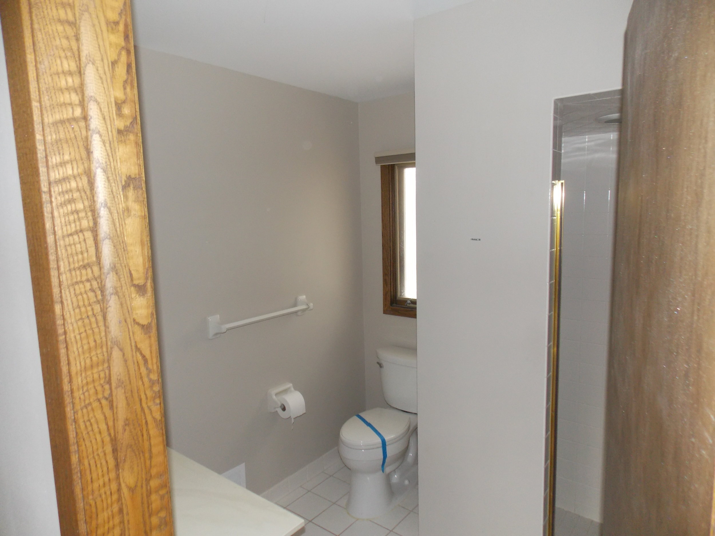
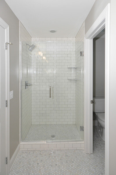
The upside of the existing layout was that it already had a master bathroom, but the downside is that it was cramped and poorly laid out. We took the space from the existing master bath and also stole the space from the existing master closet (as seen above, we didn't need any additional master closet space after our space reassignment!) to create a larger and more luxurious master bathroom.
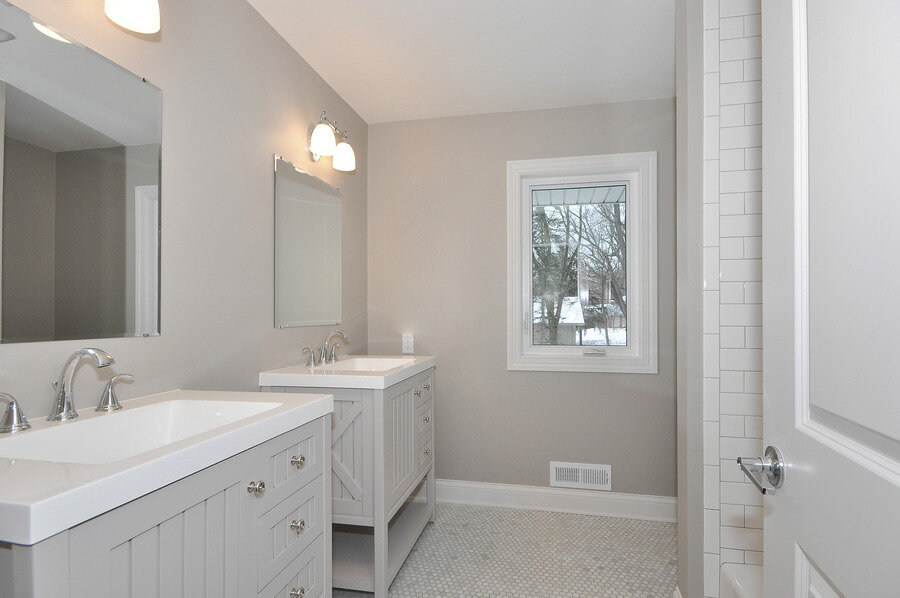
The existing hall bathroom was surprisingly spacious. We kept the layout exactly the same, but did two separate vanities instead of one large. The angles are a bit off in these photos, but you get it. This is my favorite bathroom we've ever done.
LOWER LEVEL
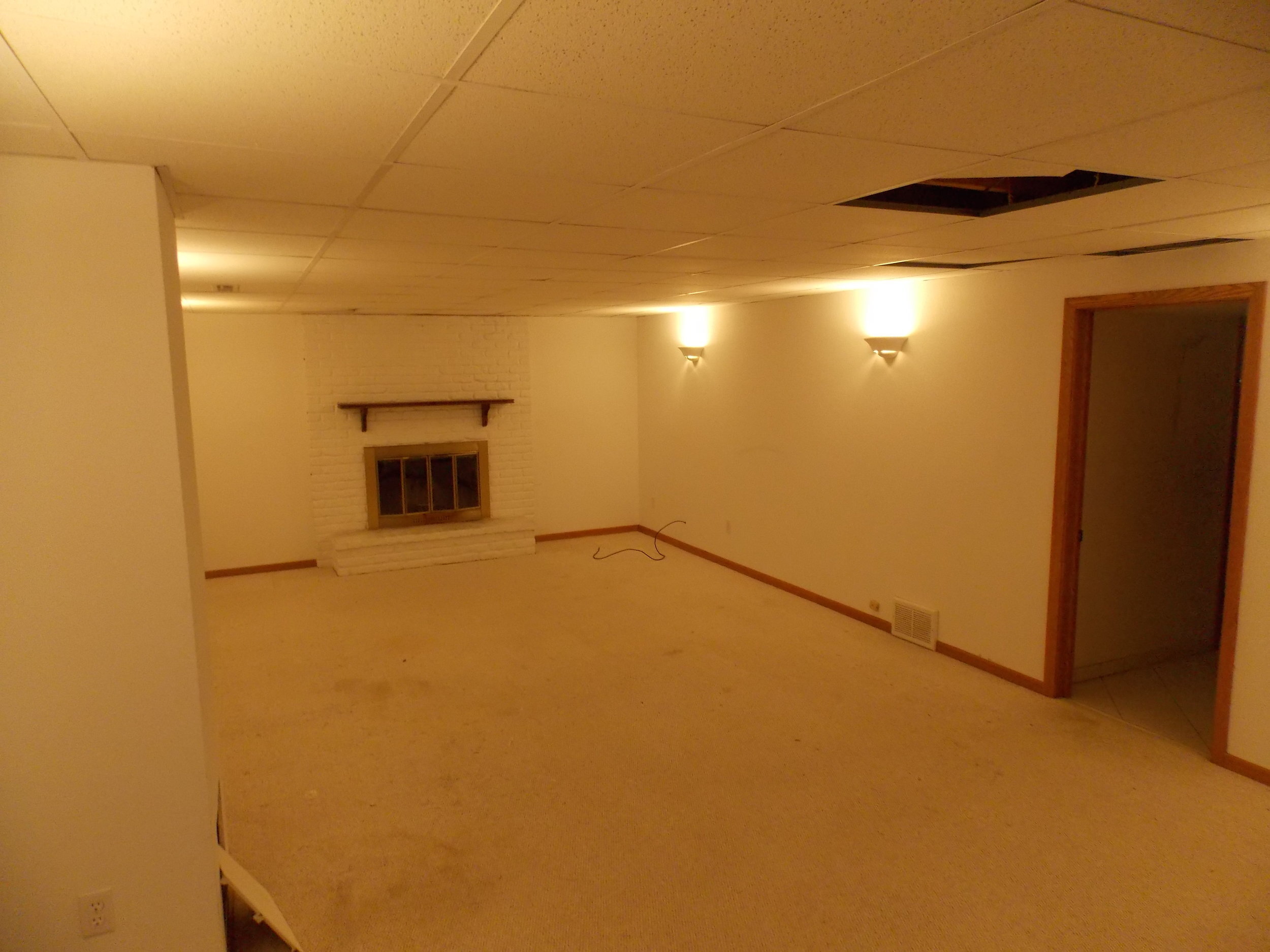
We didn't change much with the basement layout, but we put in all new drywall and a real ceiling. We also added recessed can lights, which added SO much additional light. Recessed lighting in a basement is always a good idea in my opinion!
We did a fairly simple fireplace refresh by just painting the existing brick and fireplace cover. We removed the half broken mantel and decided we liked the clean look without it.
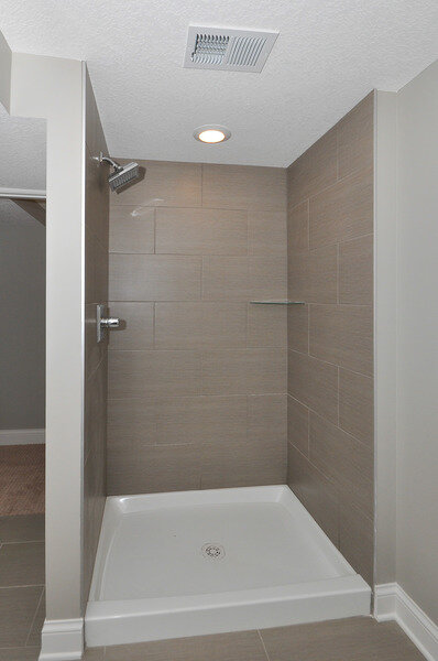
We planned to gut the basement bathroom, but keep the layout the same to keep costs down. Well, things don't always go as planned. The shower drain had some issues, so we had to do much more work (and spend more money) than planned.
For the basement shower, we wanted to give a high end look with wall tile, but decided to save cost and use a shower liner pan for the bottom. It saved us quite a bit of money after our additional amount spent on chipping out the entire floor unexpectedly due to the drain issue!
Well, there she is! We spent much more time and money on her than originally planned, but she is quite lovely and was worth all the extra headaches.
Thanks for reading! As always, if you have any questions on paint colors or products, please let me know. And if you like what we see, ask us about searching with you for the perfect house to renovate. It's easier than you think and typically leaves you with awesome equity from the day you close!

